Course Objective
The aim of the course is to develop the skills needed to design a publication that combines image and text — from concept and typesetting, through preparation for print, to digital publication.
Semester Assignment
The semester assignment is an illustrated magazine, prepared in four stages:
- Design and typesetting of an illustrated magazine
- Preparing the magazine for print — inside pages and cover
- Preparing the magazine for digital publication — interactive PDF
- Export to EPUB — with animation and sound
Stage 1: Design and Typesetting of an Illustrated Magazine
The magazine contains one of two texts to choose from. Students select the illustrations themselves.
|
Topic |
Content |
Recommendations |
|
14 Stops |
Punctuation marks in the English language |
The design explores the layout and design potential of each individual typographic mark. The magazine may be illustrated entirely with typographic marks, although other images (photographs, illustrations) are not excluded. |
|
DADA |
The history of the art movement |
The text is illustrated with images available online. The closing manifesto text invites the use of experimental typography. |
Recommendation for both topics: use the fonts provided by the teacher.
Stage 2: Preparing for Print
Students prepare two separate print-ready files: the inside pages of the magazine and the cover.
Stage 3: Digital Publication — Interactive PDF
The magazine is prepared for digital publication as an interactive PDF, enhanced with interactive elements.
Stage 4: Export to EPUB
The magazine is exported to EPUB format, and its digital version is enhanced with animation and sound.
Illustrated Magazine — Two Examples
“Fourteen Stops — A Magazine About Punctuation”
“Dada — History and Legacy”
This brief sets out the guidelines for designing two illustrated editorial magazines based on the supplied source texts. The task involves a harmonious composition of image and text, an appropriate choice of typefaces, and the design of a consistent, repeatable layout grid.
Images should be selected independently.
1. Purpose and Objectives of the Assignment
Based on the supplied texts:
download texts
design a mock-up of two issues of an illustrated magazine. Each title requires its own visual identity — its own typography, colour palette, and graphic motif — matched to the character of its content, while observing shared principles of good editorial composition:
- a consistent, repeatable layout grid used throughout the issue,
- a clear typographic hierarchy (title → lead → subheading → body text → captions),
- a considered relationship between image and text on every spread,
- a complete editorial structure: cover, table of contents, chapters, masthead/colophon.
Suggested length: 24–32 pages per title (to be agreed with the instructor). Points 2–5 below are source material for the student’s own design decisions, not a ready-made template to copy.
2. Standard Magazine Formats
An overview of the most commonly used periodical formats — a starting point for choosing the mock-up’s format.
|
Format |
Dimensions |
Typical Use |
|
A4 |
210 × 297 mm |
the most popular European format for cultural, opinion and business magazines; convenient for digital and offset printing |
|
A5 |
148 × 210 mm |
zines, small independent publications, thematic supplements |
|
B5 |
176 × 250 mm |
an intermediate format, catalogues and book-like periodical publications |
|
US Letter (magazine) |
215.9 × 279.4 mm (8.5 × 11 in) |
the standard for American consumer magazines |
|
Digest |
139.7 × 215.9 mm (5.5 × 8.5 in) |
a compact, “pocket” literary format |
|
Square |
210 × 210 or 240 × 240 mm |
lifestyle and art magazines, strongly photographic |
|
Tabloid / Berliner |
approx. 280 × 400 mm |
a large, poster-like photographic format, artistic and avant-garde publications |
Recommendation for Both Titles
Fourteen Stops: portrait A4 (210 × 297 mm) — a classic, legible editorial format, leaving room for a manuscript grid with a margin for the definition box. A more intimate variant: a narrowed block, e.g. 190 × 260 mm, underscoring the “pocket-sized”, micro-essayistic character of the text.
Dada — History and Legacy: a 240 × 240 mm square or A4 — an experimental format that shows archival photographs, collages and avant-garde typography to good effect. The square reinforces the “object-like”, poster character of the content and sets the title apart from the classic A4.
3. Example Layout Grids
Four base grids that can be combined within a single issue (e.g. a text grid for the essay, a modular grid for photography). The spreads show a pair of pages (left/right) with margins and gutter marked.
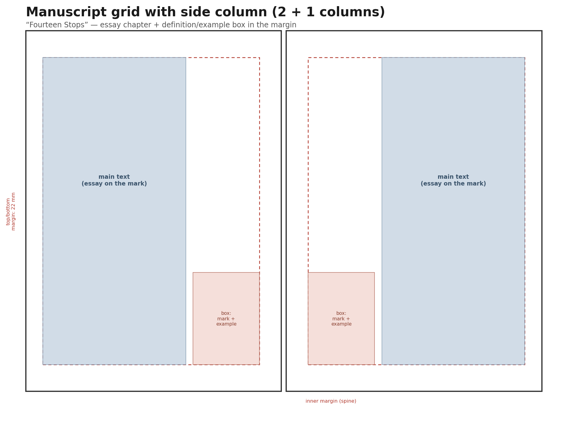
3.1 Manuscript Grid with Side Column (2 + 1 Columns)
A main column for the essay text plus a narrow side column for a box: definition of the mark and an example of its use. Recommended for the “14 Stops” chapters.
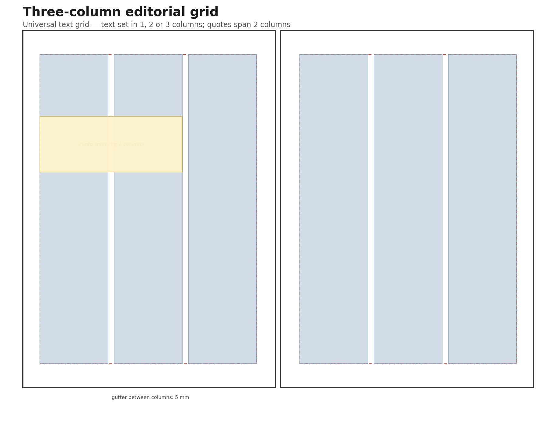
3.2 Three-Column Editorial Grid
A universal text grid for both titles — text set in 1, 2 or 3 columns; quotes and mottos span 2 columns.
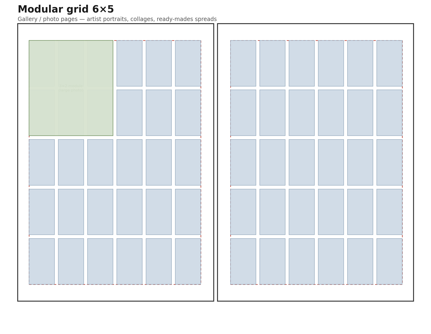
3.3 Modular Grid 6×5
Gallery / photo pages — artist portraits, collages, ready-mades spreads. Recommended for the biographical chapters in “Dada”.
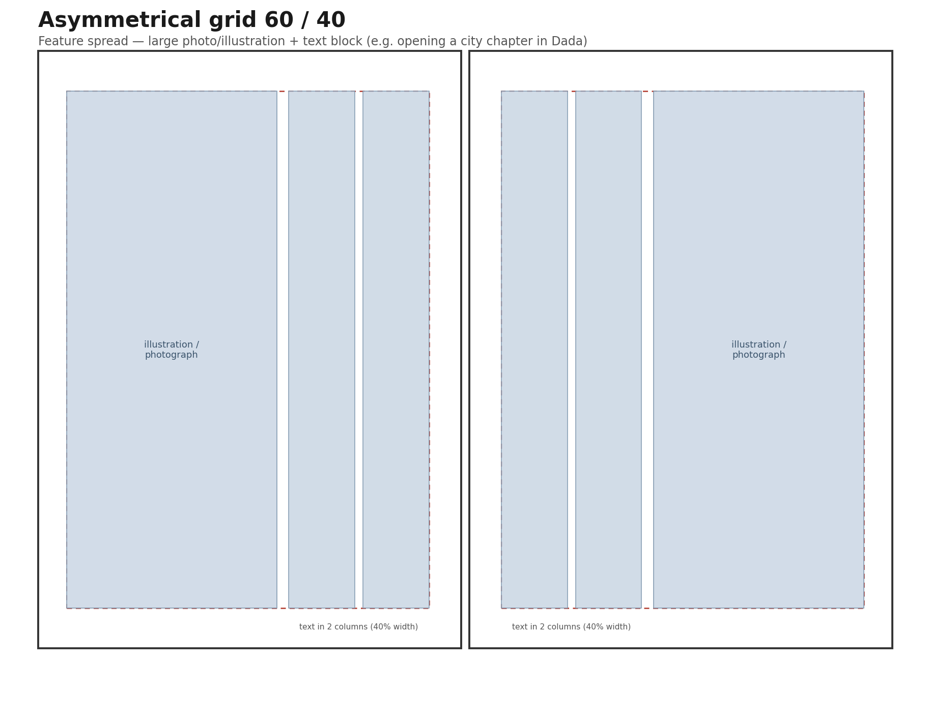
3.4 Asymmetrical Grid 60/40
A large photo/illustration plus a text block in 2 narrow columns. Recommended for opening the city chapters in “Dada” and for pages devoted to selected, more illustrative marks in “14 Stops”.
4. Example Magazine Structure for Both Titles
4.1 “Fourteen Stops — A Magazine About Punctuation”
Masthead / Colophon
- title and issue number, e.g. “Fourteen Stops, No. 1”
- publication date
- editor / author of the text
- graphic design and layout
- source of illustrations/photographs
- printer and print run (for the mock-up’s realism)
- contact details, editorial address, website address
- ISSN number (fictitious, for the purposes of the exercise) and copyright notice
Table of Contents
A layout that echoes the title — a route/line diagram with stops, grouped into five “lines” following the division used in the source text:
- Introduction
- Line I — At the End of the Sentence: 1. Full stop 2. Question mark · 3. Exclamation mark
- Line II — Pauses and Connections: 4. Comma 5. Semicolon · 6. Colon
- Line III — Dashes: 7. Em dash 8. Hyphen
- Line IV — Brackets: 9. Parentheses 10. Square brackets · 11. Curly braces
- Line V — The Rest of the Family: 12. Apostrophe 13. Quotation marks · 14. Ellipsis
- Epilogue
Chapter Layout (Repeatable Pattern — 14 “Stops”)
- Opening page: the punctuation mark itself at a very large scale as a graphic element, chapter title, a short teaser quote from the text
- Development: the essay set on the manuscript grid — main text column + side box
- Definition box: a formal definition of the mark plus an example of its use, set off by colour and an accent typeface
- Closing the stop: the punctuation mark as a small “stamp” beside the page number, consistent throughout the issue
4.2 “Dada — History and Legacy”
Masthead / Colophon
- title and issue number, e.g. “Dada. History and Legacy, No. 1”
- editorial team / author of the text, graphic design and layout
- sources of reproductions and archival photographs (space for copyright credits for the works)
- place and date of publication
- a note on the nature of the issue (e.g. “a commemorative issue”), echoing the ephemerality of the original Dadaist publications
- a motto — an excerpt from the “Dada Manifesto 1918” closing out the masthead
Table of Contents
Laid out as a journey through cities, following the chronology and geography of the source text:
- From the Beginning — Cabaret Voltaire, 5 February 1916
- Zurich — Switzerland as a Haven · The Inaugural Evening · Scandal as a Double-Edged Weapon · The Mystery of the Name · Dada and Futurism · Galerie Dada
- Germany — Berlin (Baader, Hausmann, Grosz, Höch) · Hanover (Schwitters, Merz) · Cologne (Ernst, Klee, Breton)
- New York — Duchamp, Picabia, Man Ray, ready-mades
- Paris — the capital of Dada, Man Ray, the end of the Tzara–Breton alliance
- Appendix — “Dada Manifesto 1918” (excerpt)
Chapter Layout (Repeatable Pattern — City Chapters: Zurich / Germany / New York / Paris)
- Opening spread: the city name in a very large, poster-style typeface on the 60/40 asymmetrical grid, with an archival photograph or collage
- Biographical spreads: modular grid with portraits and short notes on the artists active in that city
- Quotes and manifesto excerpts: set off as blocks, composed in a typewriter face, arranged freely in the spirit of Dadaist compositions (irregular angles, overlapping elements)
- Closing the chapter: the transition to the next city marked by a consistent graphic element (e.g. a line/arrow tracing the journey)
5. Font Proposals (Google Fonts)
5.1 “Fourteen Stops”
|
Role |
Font |
Rationale |
|
Titles / chapter headings |
Download font |
a high-contrast, lively display serif with a “handwritten” character — every punctuation mark, as the author puts it, has “a temperament of its own” |
|
Subtitles / “Line I–V” numbering |
Download font |
a geometric, precise sans — contrasts with the serif title and underscores the orderly, “technical” side of punctuation |
|
Body text |
Download font |
a serif designed for long-form reading on screen and in print; elegant, expressive italics — important, since the text includes many examples and quotations set in italics |
|
Accent — definition boxes |
Download font |
a monospaced face that echoes “technical” notation (cf. the curly braces mentioned in the text); shows individual glyph forms well |
5.2 “Dada — History and Legacy”
|
Role |
Font |
Rationale |
|
Titles / city names / cover |
Download font |
a bold, condensed poster typeface inspired by signage and typographic printing of the early 20th century; scales well to very large sizes |
|
Subtitles / dates and places |
Download font |
a typewriter-like rhythm evoking the typed flyers and Dadaist manifestos |
|
Body text |
Download font |
a solid, “archival” serif with good legibility over long passages of historical text — a calm backdrop for the experimental headings |
|
Accent — manifesto quotes |
Download font |
a typeface imitating typewriting — a natural choice for quoting passages from the authentic “Dada Manifesto 1918” |
All the typefaces listed are available free of charge on Google Fonts (fonts.google.com) and can be paired for title/body text as shown in the tables above; the choice of weights and italics is left to be refined at the mock-up design stage.
6. Cover Design
The cover functions as both a poster and the issue’s business card — it is what decides whether a reader picks up the magazine, and it is the one page that must work on its own, detached from the context of the interior. The guidelines below cover design principles, the required informational content, and preparing the files for print (page 4, spine, and optionally pages 2 and 3, plus bleed).
6.1 Cover Design Principles
- Information hierarchy: 1) magazine logotype/name, 2) the issue’s main image/motif, 3) content teasers (cover lines), 4) issue number and date — in this order of visual importance.
- Legibility at a distance: the cover must “work” as a thumbnail and from a distance (on a shelf, as a cover on social media) — a large, high-contrast title, a limited number of elements.
- Top zone (top third of the page) is the most exposed area — this is where the magazine’s logotype should sit, remaining legible even if the bottom of the cover were partly obscured.
- Consistency with the interior identity: the same (or related, display) typefaces and the same colour palette as inside, but at a larger scale and with greater compositional freedom.
- Tension between image and typography: the title and cover lines may overlap the photograph/illustration, provided legibility is preserved (tonal contrast, a “quiet” area in the frame for text).
- Simplicity: the cover is not the place to summarise the whole issue — it is an entry point, not a table of contents.
Fourteen Stops: a cover built around a single, dominant punctuation mark at a very large scale (e.g. quotation marks or an exclamation mark) as the main graphic motif, in the spirit of the chapter-opening pages. Title set in Fraunces.
Dada: a cover in the spirit of a Dadaist poster/collage — a broken grid, overlapping elements, Big Shoulders Display paired with an archival photograph or collage.
6.2 Information on the Cover (Page 1)
Required:
- magazine name / logotype
- issue number and date (month or season, year)
- main theme / headline of the issue (the main cover line)
Recommended, for the mock-up’s realism:
- 2–4 additional content teasers (cover lines), ideally with a page-number reference
- a main photograph or illustration related to the issue’s theme
- price (optional)
- barcode and ISSN number in a corner of the page (mock-up, optional — to increase the realism of the mock-up)
6.3 Page Four (Back Cover)
The back cover is visually calmer than page 1 — it functions as a closing statement, not an invitation. Typical content in a student mock-up:
- a quote or motto drawn from the issue (e.g. an excerpt from the “Dada Manifesto 1918” or a line from the epilogue of “14 Stops”)
- a short description / editorial mission statement of the magazine (2–3 sentences)
- publisher details, website address, social media
- barcode and price (if used on page 1)
- a possible continuation of the graphic motif from the front cover (e.g. another variant of the same punctuation mark, another fragment of the collage)
Page four should not function as a table of contents, nor duplicate the content of page 3 — it is a separate, self-contained composition.
6.4 Spine
- The spine only becomes visible and typographically useful with perfect (glue) binding, generally from around 60–80 pages upward.
- With saddle-stitch binding — typical for a length of 24–48 pages, and so for the suggested 24–32-page range in this brief — the spine is too narrow for any graphic or text element and is, in practice, omitted from the design; pages 4–1 and 2–3 are part of the same sheets.
- If a spine is present (a mock-up with a larger page count): it carries the magazine name (set vertically), issue number and date — it must be legible when the issue is placed spine-out on a shelf.
- Spine width = (number of pages ÷ 2) × the thickness of a single sheet + cover thickness — a value to be confirmed with the printer based on the paper weight chosen.
Recommendation for both titles at a length of 24–32 pages: design the cover as a saddle-stitched booklet, with no visible spine.
6.5 Pages Two and Three (Inside Cover)
- Page 2 (inside front cover): most often a short “editor’s note” with the author’s signature, or a continuation of the cover’s graphic motif, or an extended lead for the issue.
- Page 3 (inside back cover): most often the full table of contents or the masthead/colophon — an alternative location to placing it at the end of the issue.
- Technically, with saddle stitching, pages 2–3 are printed on the same sheet as 1 and 4, but from a design standpoint they are treated as a separate spread (see the diagram in point 6.6).
14 Stops: page 2 — a short “editor’s note” echoing the idea of a route/stops; page 3 — the table of contents in the form of a line map (see point 4.1).
Dada: page 2 — a continuation of the collage from the cover, or an opening quote; page 3 — the table of contents in the form of a journey map through the cities (see point 4.2).
6.6 Technical Guidelines for Preparing the Cover for Print
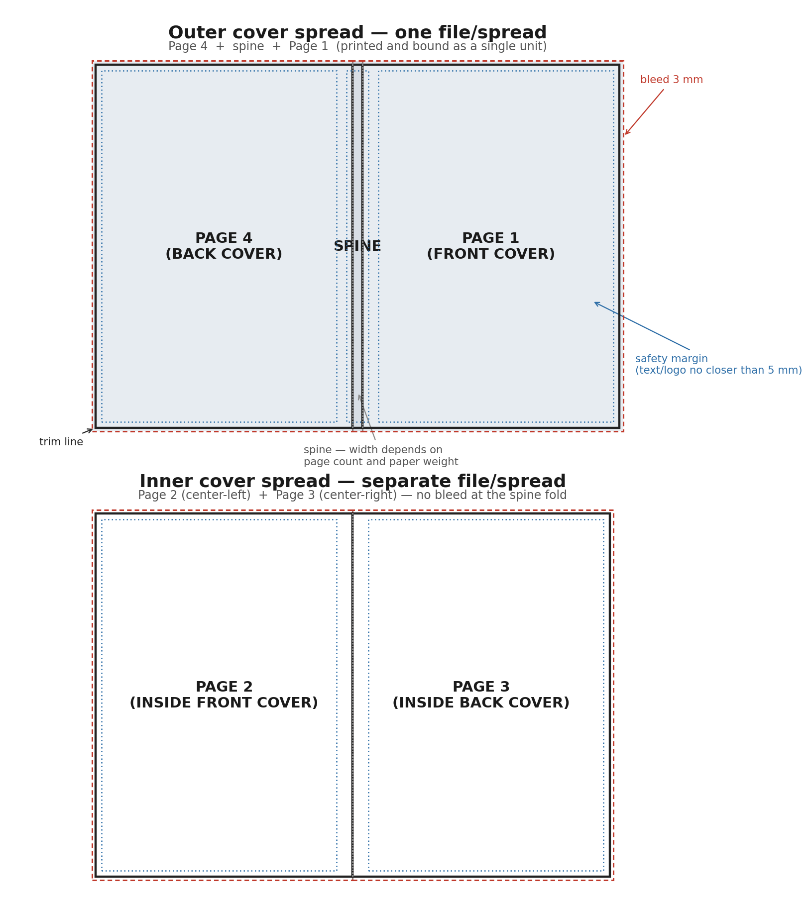
|
Parameter |
Value |
Notes |
|
Bleed |
3 mm |
on every outer edge of pages 1 and 4 (top, bottom, side); any element that reaches the edge of the page must extend beyond the trim line |
|
Safety margin |
min. 5 mm from the trim line |
increase to approx. 8–10 mm at the spine/fold — there is a risk of text being “pulled into” the binding |
|
Image resolution |
min. 300 dpi |
at the actual print size |
|
Colour space |
CMYK |
not RGB; text black at 100K, “rich black” (e.g. C40 M30 Y30 K100) only on large solid fields |
|
File format |
PDF/X-1a or PDF/X-4 |
with bleed and crop marks, fonts embedded |
|
Number of pages in the issue |
a multiple of 4 |
a requirement of saddle-stitch binding technology — already satisfied at 24–32 pages |
- Prepare the outer cover (4 + spine + 1) and the inner cover (2 + 3) as two separate files/spreads — do not combine them with the pagination of the issue’s interior.
- Before sending to print: check overprints and transparencies, embed all fonts in the PDF file, and verify that no important element (logotype, text) falls within the bleed zone or outside the safety margin.
Typography of Dadaist Manifestos
Breaking Up Traditional Typesetting
The Dadaists deliberately broke with the symmetrical, “Gutenberg” page layout — the centered text block, uniform typeface, and regular line spacing. Instead, they used:
- asymmetrical composition — elements scattered across the page, with no central axis
- breaking the grid — text does not stay within columns or margins, and can “spill” beyond the page area
- irregular spacing — between letters, words, and lines — deliberately disrupting the reading rhythm
The Letter and the Word as Image
This is perhaps the most important principle: the word stops being merely a carrier of meaning and becomes a visual element.
- mixing typefaces and weights within a single word or line (e.g., half a word in bold, half in a thin weight)
- abrupt jumps in scale — one word enormous, the next microscopic; hierarchy arises from emotion and the rhythm of the utterance, not from logical importance
- rotation and angle — text set diagonally, vertically, or upside down
- overlapping letters — letters can overlap, collide, “shout” over one another
Collage and Found Materials
Especially among the Berlin Dadaists (Hausmann, Höch, Heartfield), typography merged with photomontage:
- fragments of newspapers, tickets, stamps, and labels pasted directly into the text
- print treated as a found object — “ready-made” typography torn from its context and reused
- geometric lines, rules, and black fields as independent compositional elements, not mere ornamentation
Typography as a Notation of Sound
Ball and Hausmann created so-called poster poems (Plakatgedichte) — single letters or syllables scattered across the whole page in wildly different sizes, so that the graphic layout captured the rhythm and loudness of the spoken word. The division into lines followed breath and sound, not grammar or the sense of the sentence.
Principles You Can Apply
- Abandon centering — scatter fragments of text freely across the page
- Vary the typeface and weight within a single paragraph, or even a single word
- Play with scale without a logic of hierarchy — let importance arise from emotion, not from rules
- Introduce diagonal or vertical lines of text
- Let letters overlap one another or spill beyond the margin
- Add “found” graphic elements — lines, blots, stamp-like fonts
- Treat punctuation and spacing irregularly, instead of justifying the text