Key concepts, methodology and examples for building a new brand
1. Brand Positioning
Brand positioning is the strategic decision about the distinctive place a brand occupies in the mind of a clearly defined target audience, relative to the alternatives that audience could choose instead. It answers four questions at once:
- who the brand is for,
- which category or need-state it competes in as the customer understands it,
- what single attribute or benefit sets it apart,
- and why that difference should be believed.
Positioning is not a slogan or a piece of advertising copy — it is an internal strategic choice, decided before any communication is written, that later shapes product design, pricing, packaging, retail environment and tone of voice.
In categories crowded with near-identical offers, the brand that stands for one clear idea wins a disproportionate share of attention and preference, even when its product performs no better than competitors’ on a spec sheet.
A vague, „something for everyone” position is forgettable; a narrow, consistently defended position is memorable and hard to copy, precisely because it requires the brand to say no to opportunities that would blur it. Positioning is most often written as a single working sentence that the whole organisation can be held to, using a simple template.
Positioning statement template
For [target audience], [brand name] is the [frame of reference] that [point of difference], because [reason to believe].
Examples
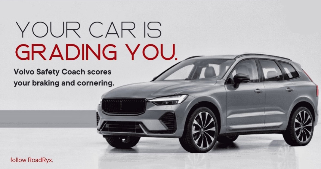
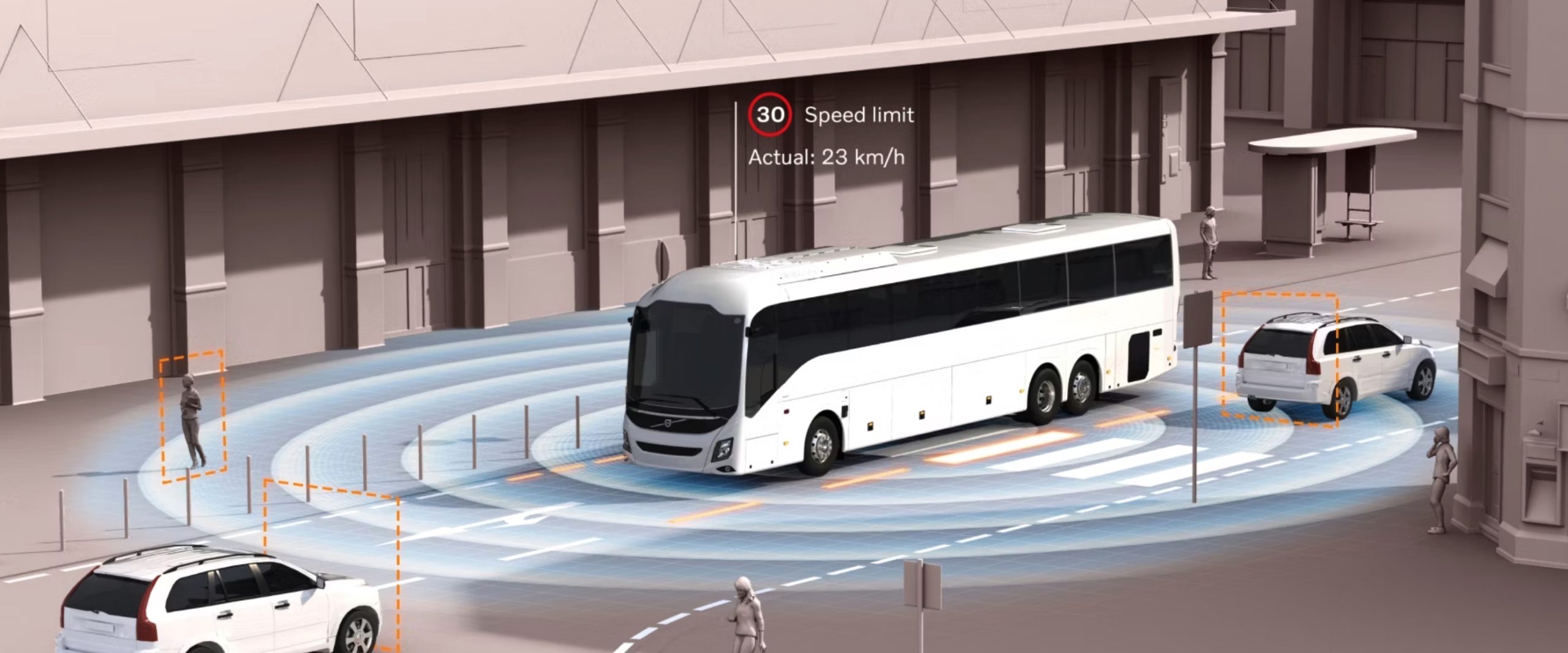
Volvo — has defended a single territory — safety — for decades, across very different products, markets and design eras, which is why the word „safety” is more strongly linked to Volvo than to rivals with comparable test scores.
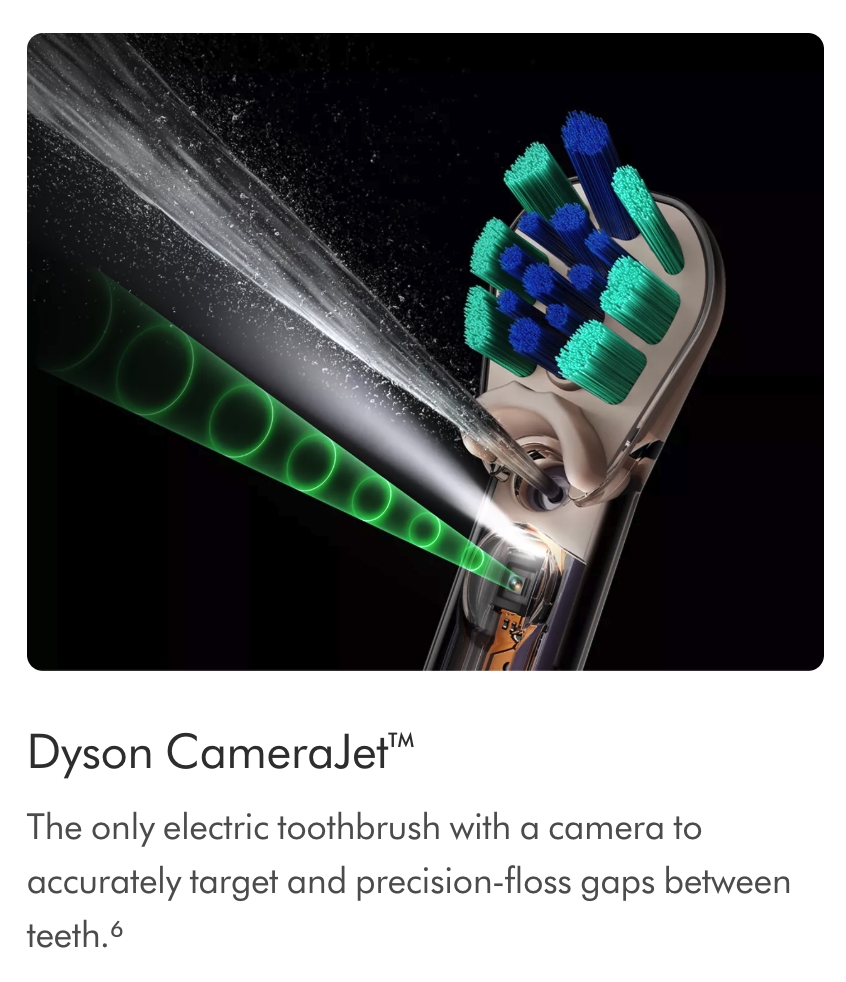
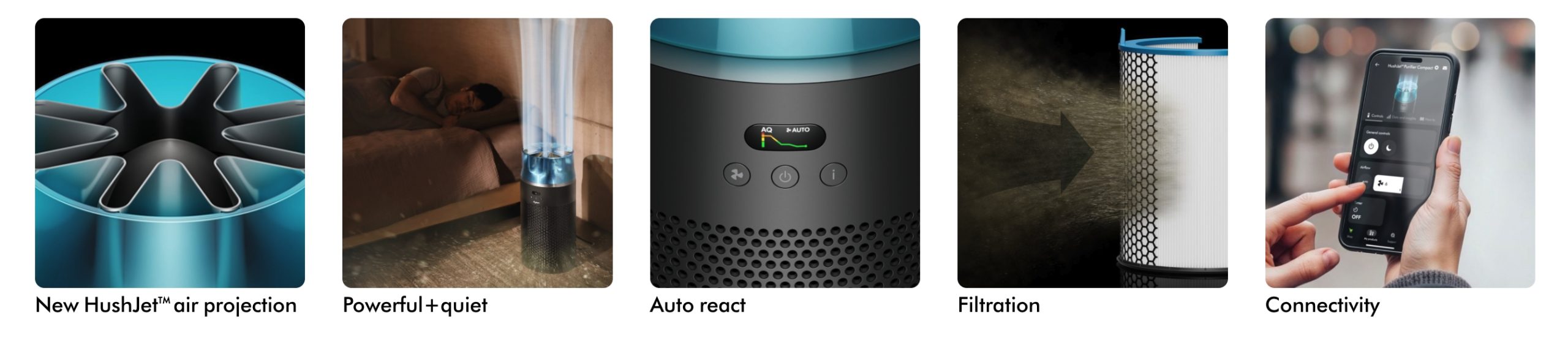
Dyson — positions itself on engineering rather than price or convenience, expressed through visible technology and exposed mechanisms rather than the usual home-appliance styling.
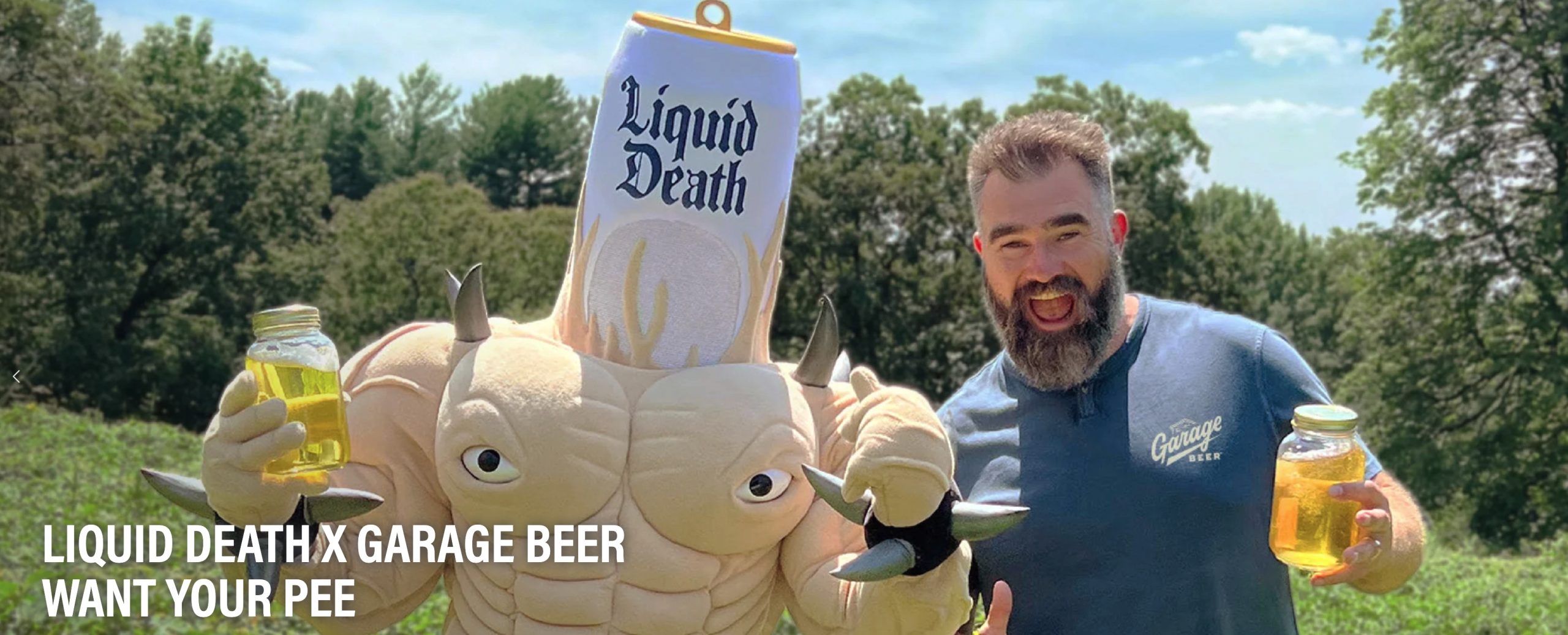
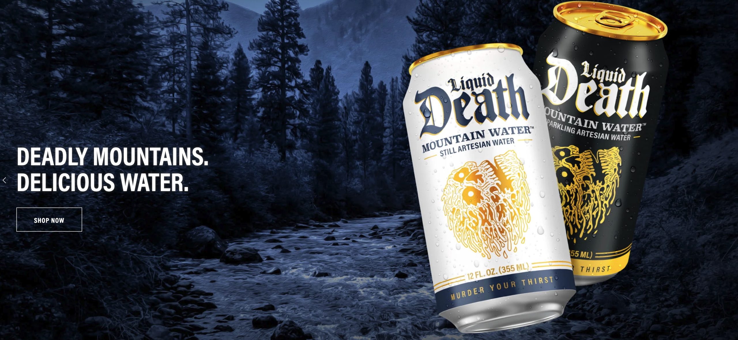
Liquid Death — positions a functionally ordinary product — canned water — around irreverent, heavy-metal branding, competing less with other water brands and more with sugary drinks for cultural relevance.
Common mistakes include positioning on a benefit any competitor can copy overnight:
- „high quality”
- „great service”
without a defensible reason to believe it; trying to own two or three ideas simultaneously, which dilutes memorability; and confusing the position itself with its outward expression — a tagline may communicate the position, but the position must first survive being written as
one plain, unglamorous sentence, internally,
before it is dressed up for an audience.
Visual Identity
1. Brand positioning
Positioning decides where the brand sits in the customer’s mind. The visual system should make that place obvious at a glance.
- Overall visual style. For example, minimal/premium, bold/popular or artisanal/handmade.
- Logo type. A wordmark, lettermark, symbol or combination mark. The type you choose shows the level of sophistication.
- Price-tier cues. White space, restraint and materials. Premium positioning usually means less on the page.
- Consistency of the whole system. A leader brand looks the same at every touchpoint.
2. Insight — A Deep Understanding of the Target Audience’s Needs and Expectations
An insight is a deep, often unspoken truth about the target audience: the tension between what a person genuinely needs and how they currently cope with that need, expressed in their own words or logic.
It is not the same as an observation or a statistic — „68% of people report poor sleep” is a fact, not an insight.
An insight explains why that fact is true at a human level and reveals the gap a brand could step into.
Good insights are usually uncomfortable, specific and slightly surprising; if a customer reads the insight statement and says
„that’s exactly it, I’ve just never put it into words”, it is doing its job.
Insights are built from real listening rather than assumption:
- qualitative interviews,
- ethnographic observation of behaviour (what people actually do, not what they say they do),
- social listening,
- customer service transcripts
- quantitative data used to find anomalies worth investigating further.
A useful discipline is to keep restating „why” to a surface-level finding until a genuine tension appears between a stated goal and an actual behaviour — this is often called laddering.
Anatomy of an insight statement
I want [outcome the person consciously wants], but I actually [behaviour that works against it], because [the deeper, less obvious reason].
Examples
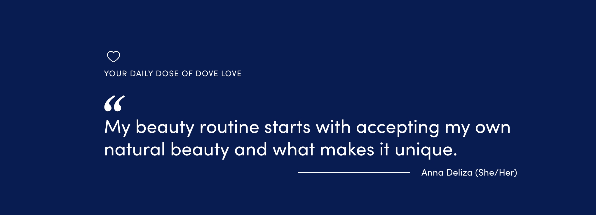
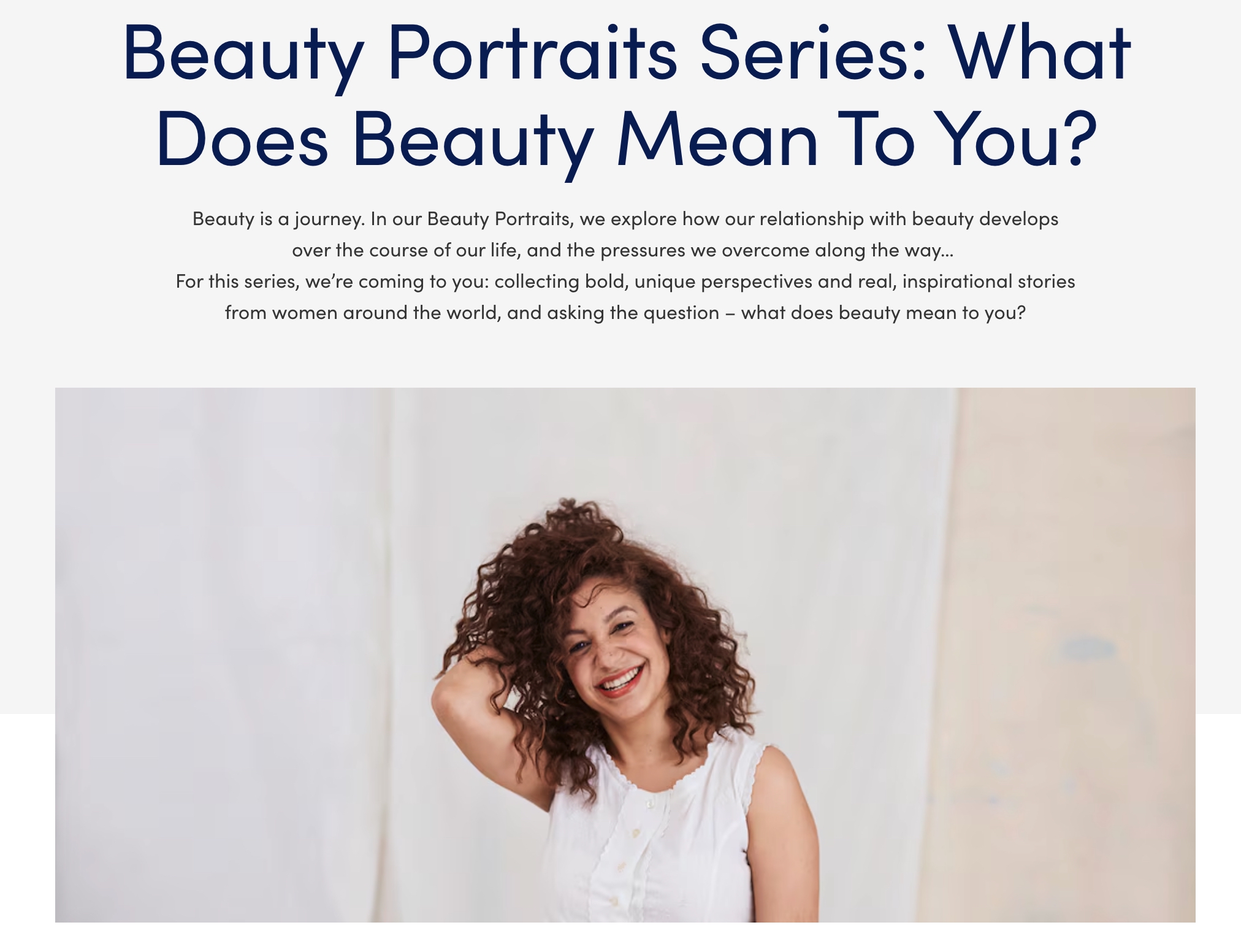
Dove — built its „Real Beauty” platform on the insight that most women compare themselves to an impossible, airbrushed standard set by the beauty industry itself, and quietly resent it — a tension between wanting to feel beautiful and being shown imagery that made that feel unreachable.
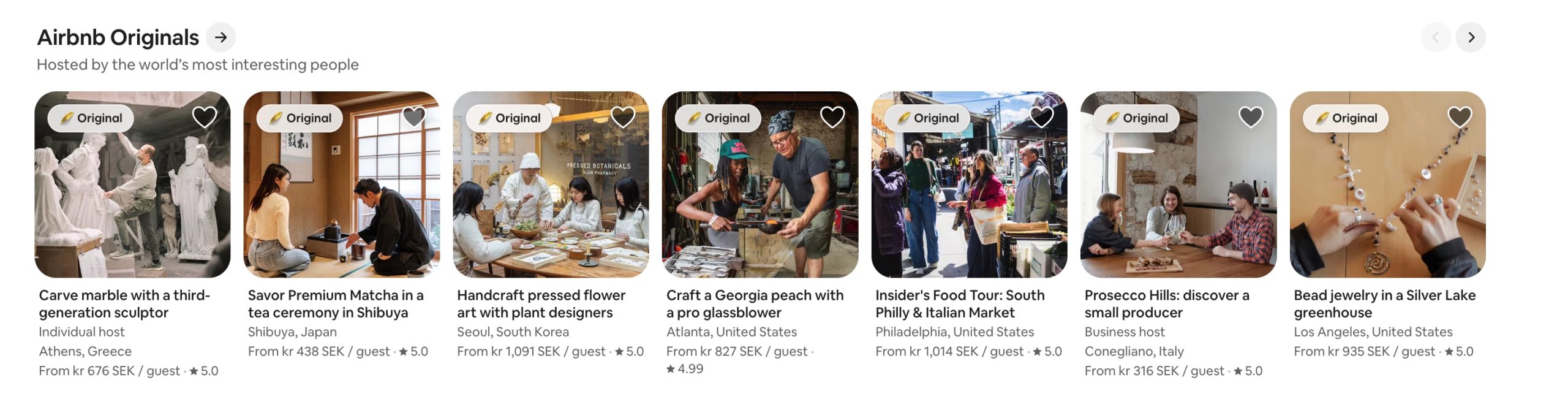
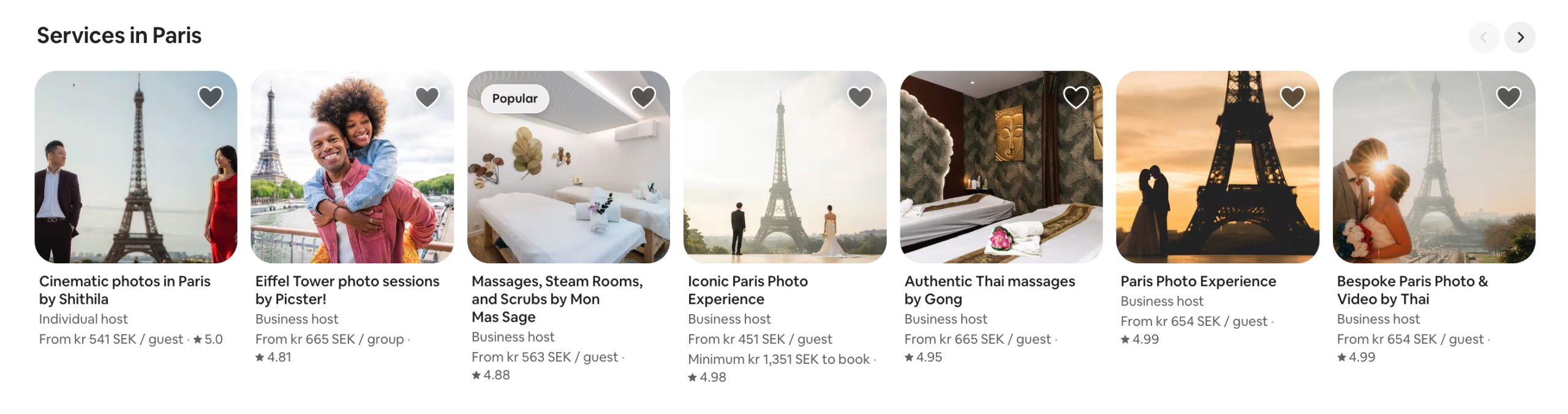
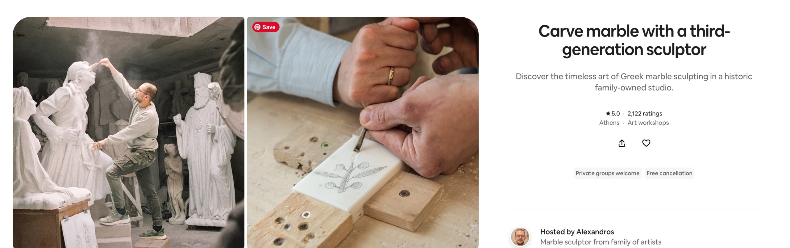
Airbnb — grew from the insight that travellers were not only searching for a place to sleep, but for a sense of belonging and local, human connection that a standardised hotel room could not offer.
Visual Identity
The insight is the human truth the brand answers. It becomes the emotional starting point of the design.
- Key visual or brand idea. One recurring image or metaphor built from the insight.
- Photography and illustration subjects. Show the customer’s real situation, tension or desire.
- Mood and atmosphere. Light, texture and composition that make the viewer think „they understand me.”
3. Brand Proposition in a Chosen Market Segment
The brand proposition is a concise statement of what the brand offers to a specific, chosen segment of the market, and how that offer answers the segment’s needs better than the available alternatives.
Where positioning defines the territory a brand wants to own in the customer’s mind, the proposition is the bridge between the insight and the concrete, purchasable offer:
- it names the segment
- states the need
- and states the response.
Choosing the segment is a deliberate act, not an afterthought. Markets are commonly segmented along four dimensions:
- demographic (age, income, location, life stage)
- psychographic (values, attitudes, lifestyle)
- behavioural (usage frequency, loyalty, occasions of use)
- needs-based (the job the customer is trying to get done).
A strong segment choice is one the brand can serve distinctively — large enough to be commercially viable, but narrow enough that a single proposition can genuinely fit all of it. Serving „everyone” is not a segment; it is the absence of a strategic choice
Proposition statement template
[Brand] offers [chosen segment] [core offer], designed to [address the segment’s specific need] better than [category alternatives].
Examples
Method (cleaning products) — chose design-conscious, environmentally aware urban households as its segment, and built a proposition around cleaning products attractive enough to leave on the counter — a segment mainstream cleaning brands were not addressing directly.
Oatly — chose coffee-shop customers who wanted a plant-based alternative that behaved like dairy in espresso — a narrow, functional need within the broader plant-milk market — before expanding once that segment was won.
A niche travel brand — might choose solo travellers over 50 as its segment, proposing itineraries designed around comfort, safety and companionship that mainstream travel agencies, built around families or couples, do not design for.
A proposition should be re-examined whenever the target segment shifts, because a proposition that once fit a segment precisely can become generic as competitors adapt, or as the segment’s own needs evolve — which is why this step is revisited far more often than brand essence, which is meant to stay stable.
Visual Identity
The proposition is what the brand promises to this particular segment. The visuals must speak that segment’s visual language.
- Colour palette chosen for the segment’s cultural codes and expectations.
- Typography, meaning the primary and secondary typefaces, matched to the segment. Examples: a classic serif for tradition, a geometric sans for modernity, a hand-drawn face for craft.
- Tone of imagery: aspirational, documentary, playful or intimate.
- Format and medium choices: print, digital, packaging, social.
4. Take Out — Unique Value Proposition (UVP)
The Take Out, more commonly known as the Unique Value Proposition, is the single sentence a customer should carry away from any encounter with the brand — the most compressed, most distinctive expression of value the brand offers. Where the proposition can be a full paragraph describing an offer to a segment, the Take Out compresses that offer into one line simple enough to repeat from memory, and specific enough that it could not honestly be said about a competitor.
A strong UVP is:
- unique (not interchangeable with a rival’s claim),
- valuable (it addresses something the customer actually cares about, not a feature only the brand’s engineers find exciting),
- provable (it can be backed by a Reason To Believe, not just asserted)
- memorable (short enough to survive being repeated by a customer to a friend).
Many UVPs fail simply because they describe a category-wide expectation rather than a genuine point of difference — „fresh ingredients” is not a UVP for a restaurant, because customers assume it by default; it only becomes one if the category norm is genuinely to use frozen or pre-processed ingredients.
Examples
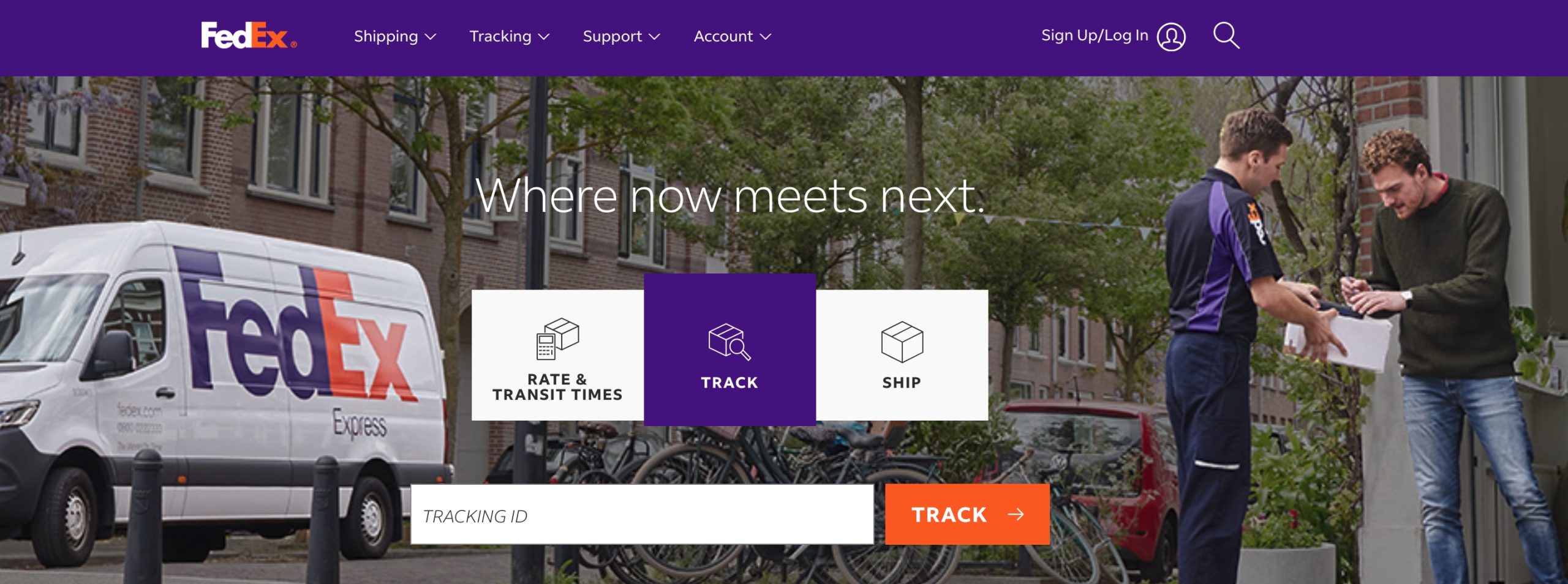
FedEx — „When it absolutely, positively has to be there overnight” — a promise no domestic postal service of the era could make credibly.
Domino’s Pizza (historic claim) — „Delivered in 30 minutes or it’s free” — a UVP so concrete it doubled as its own Reason To Believe.
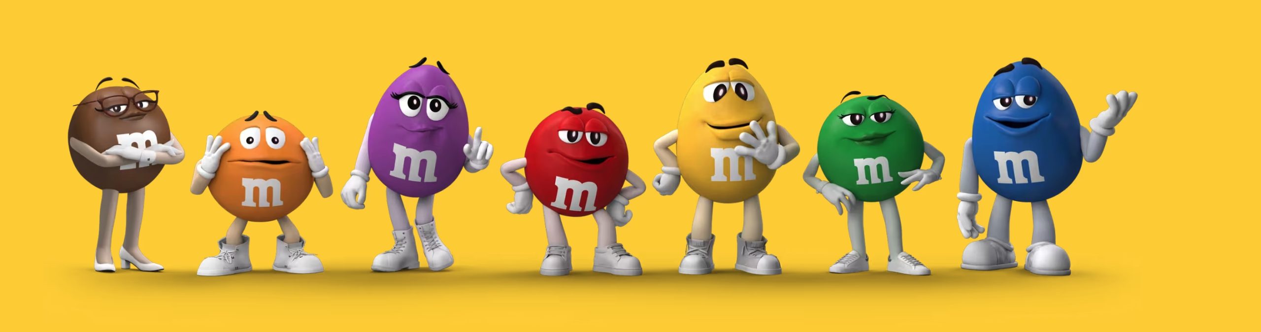
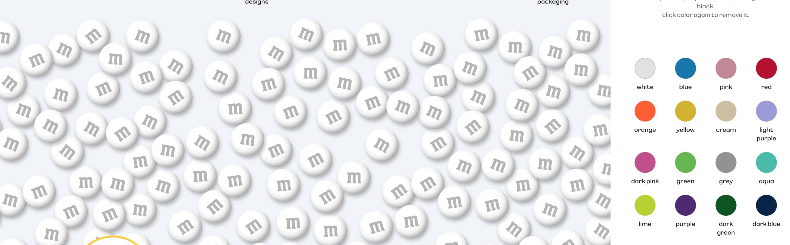
M&M’s — „Melts in your mouth, not in your hand” — a specific, sensory, ownable claim built directly into the product’s physical design (a candy shell).
Visual Identity
The take out is the single thing the audience should remember. The design has to make that one message dominate.
- Visual hierarchy. One focal point in each layout.
- Tagline lock-up. How the slogan sits next to the logo.
- Signature element. A distinctive, repeatable asset such as a shape, pattern, colour or graphic device.
- Memorability test. Can someone sketch the brand from memory?
5. Rational and Emotional Benefits for Customers
Rational benefits are the measurable, functional outcomes a customer gets from using the product — outcomes that can usually be described in objective, comparable terms:
- faster,
- cheaper,
- longer-lasting,
- more effective,
- easier to use.
Emotional benefits describe how the brand makes the customer feel, and what it says about them to themselves and to others —
- safer,
- more capable,
- more respected,
- more at ease,
- more themselves.
Customers typically justify a purchase with rational benefits („I bought it because it lasts longer”) while being driven to buy, and to stay loyal, largely by the emotional benefit underneath that justification.
A common way to map this relationship is the benefit ladder:
a product feature (what it literally has or does)
leads to→
a rational benefit (what that feature lets the customer do or avoid),
which in turn leads to→
an emotional benefit (how that outcome makes the customer feel about themselves or their life).
Working up this ladder, feature by feature, is one of the most reliable ways to discover a brand’s real emotional territory, because it grounds the emotional claim in something the product can actually deliver — an emotional benefit invented without a rational chain beneath it tends to feel hollow.
Benefit ladder example (running shoes)
Feature: cushioned midsole with impact-absorbing foam.
Rational benefit: reduces joint strain, allows longer runs with less pain.
Emotional benefit: the confidence to set a bigger goal — a first 10K, a first marathon — without fear of injury holding the runner back.
Examples
Volvo — rational: crumple zones, collision-avoidance sensors, crash-test results. Emotional: the peace of mind of driving your family without a background worry.
Nike — rational: engineered cushioning and traction for measurable performance gains. Emotional: the identity of being — or becoming — an athlete, regardless of skill level.
Visual Identity
Rational benefits are shown through clarity. Emotional benefits are shown through feeling.
- Rational: clear information design, icons, pictograms, readable typography, grids and structure, infographics, product shots.
- Emotional: colour psychology, expressive photography, textures, gesture and movement in the layout, the brand’s own illustration style.
6. RTB — Reason To Believe
The Reason To Believe is the concrete, checkable evidence that makes a brand’s promise credible rather than merely asserted. Every positioning statement and every UVP eventually reaches the word „because” — the RTB is whatever fills that gap. Without it, even a perfectly worded promise reads as an empty slogan, because customers today are used to discounting marketing claims until they see proof.
RTBs typically fall into a small number of recognisable types:
- product attributes and formulation (a specific ingredient, material or technical specification);
- process and provenance (how or where something is made, and by whom);
- third-party validation (certifications, awards, expert endorsement, independent test results);
- track record (years in business, number of customers served, documented outcomes);
- guarantees (a concrete promise backed by a refund or replacement policy that puts the brand’s own money behind the claim);
- transparency (openly publishing information competitors keep hidden, such as full ingredient lists, sourcing maps or cost breakdowns).
A useful discipline when building RTBs for a new brand is to draft the promise first, then ask „what would have to be true for a skeptical customer to believe this” — and build, source or certify exactly that, rather than reaching for generic reassurance language after the fact.
Examples
A skincare brand — claiming „clinically proven to reduce fine lines” needs an actual clinical trial, with a sample size and result it can cite, or the claim collapses under the first skeptical question.
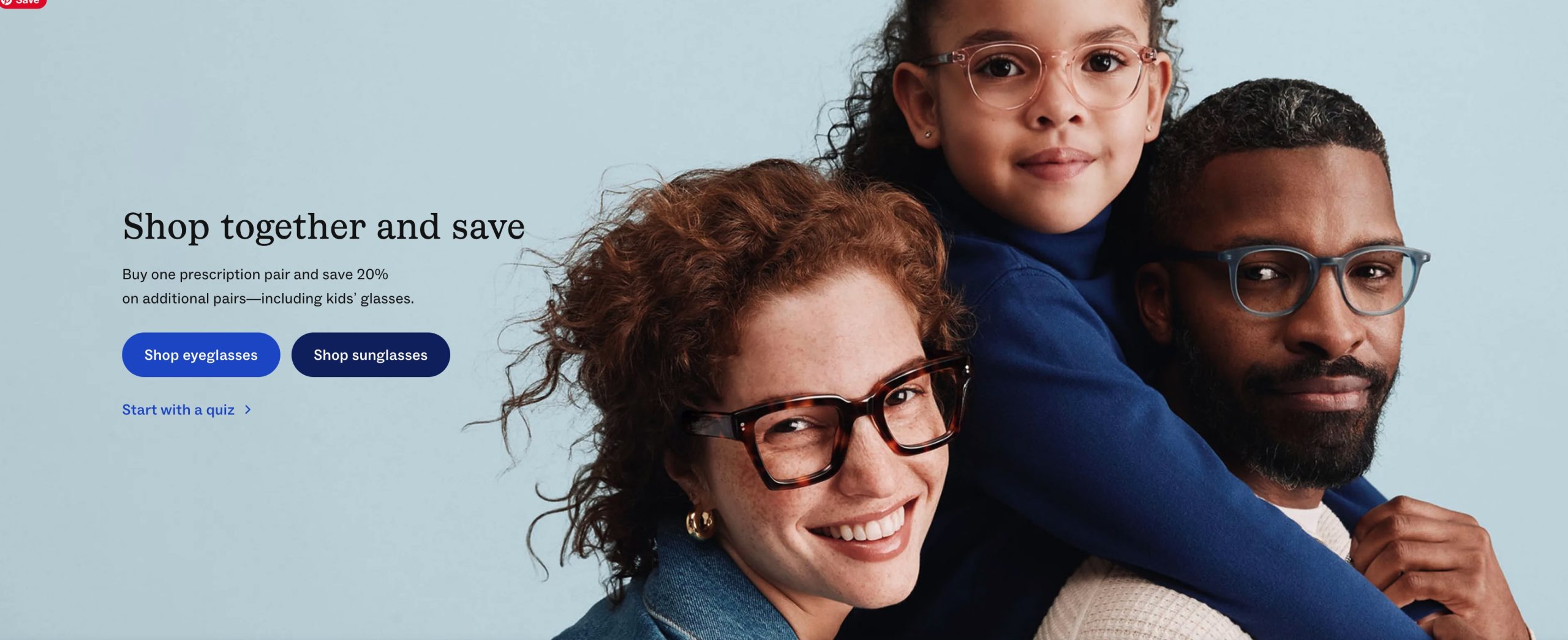
Warby Parker — supports its affordability promise with a stated, transparent reason — cutting out traditional eyewear retail markups by selling direct to the customer — turning a price claim into a believable business-model story rather than a vague discount.
Visual Identity
hese are the visual proofs that make the promise credible.
- Authentic photography: real people, real process, behind the scenes, no stock images.
- Craft and quality signals: materials, finishes and printing techniques.
- Heritage marks: „since…” dates, seals, signatures, certificates, awards.
- Consistency and precision in execution. Sloppy design undermines credibility.
7. Brand Essence
Brand essence is the shortest possible expression of a brand’s character and reason for being — typically two or three words that are meant to stay constant even as the product range, campaigns and market conditions change around them. It functions as the brand’s DNA: the single idea from which tone of voice, visual identity, product decisions and even hiring culture can all be derived, so that decisions made years apart, by different people, still feel like they belong to the same brand.
Essence is usually distilled through a structured process often called the brand pyramid or brand onion, which strips a brand down layer by layer:
- attributes (what the brand concretely has or does),
- functional benefits (what those attributes let the customer achieve),
- emotional benefits (how that makes the customer feel),
- brand personality (if the brand were a person, how would they behave),
- values (what the brand believes in),
- essence — the single idea that, if removed, would make every layer above it fall apart.
A good essence is short enough to fit on a business card, timeless enough to survive a decade of product changes, and inspirational enough that employees can use it to make a judgement call without needing a rulebook.
Essence should not be confused with a tagline, which can and does change over time; the essence is what the tagline is trying to express in that particular market moment, and a brand can rewrite its tagline many times while its essence stays exactly the same.
Examples
Nike — „Authentic Athletic Performance” — an essence broad enough to stretch from professional athletes to a beginner’s first run, but specific enough to exclude fashion-only positioning.
Disney — „Magic” — an essence that has guided theme parks, films, merchandise and hospitality standards alike for generations without needing to be rewritten.
Volvo — „Safety” — an essence so tightly held that engineering decisions are reportedly weighed against it before cost or styling.
Visual Identity
The essence is the brand’s soul in two or three words. It is the filter every visual decision passes through.
- Core symbol or logo concept that expresses the essence.
- Primary brand colour. The one colour that „is” the brand.
- Design principles: three to five rules derived from the essence, such as „quiet, organic, honest.”
- Brand pattern or graphic language that carries the essence across all media.
8. Brand Target Group
The brand target group is more than a demographic bracket — it is a description of a real kind of person:
- their lifestyle,
- attitudes,
- the specific moments in their day when the brand’s need arises,
- the emotional stakes attached to that need.
The more concrete and human the description, the easier it becomes to make consistent product, tone-of-voice and channel decisions later, because the team can ask „would this specific person actually want this” instead of debating abstractly.
Target groups are typically defined across several layers:
- demographics (age, income, location, life stage),
- psychographics (values, interests, self-image),
- behaviour (how the person currently solves the need, what they have already tried and rejected)
- occasion (the specific moment — time of day,
- emotional state, social context — in which the brand becomes relevant).
Many teams translate this into one or more personas: named, illustrative individuals built from real research patterns rather than a single real customer, used as a practical stand-in whenever the team needs to test whether a decision fits the target group.
Persona template
[Name], [age], [occupation/life stage], living in [context]. Currently deals with [the need] by [current, imperfect behaviour]. Feels [emotional tension] about it. Values [attitudes relevant to the brand].
Example persona
Elena, 31, freelance graphic designer working from home in a mid-sized city. Currently manages stress with a rotation of half-finished wellness apps and supplements she rarely restocks. Feels quietly guilty for not being more consistent, despite genuinely trying. Values honesty over polish, and is more persuaded by a brand that admits a limitation than one that promises everything.
A well-written target group description should make at least one decision easier to defend — a price point, a tone of voice, a channel choice — and should be revisited whenever sales data or research suggests the brand is actually being adopted by a different group than the one it was designed for.
Visual Identity
The target group is who the brand speaks to. The visuals must fit their taste, habits and channels.
- Aesthetic references the group identifies with.
- Representation. The people shown in imagery should reflect the audience or the audience’s aspirations.
- Channel-specific formats, such as social media templates, website UI and print collateral.
- Accessibility: contrast, font size and legibility suited to the audience.
9. Competitive Analysis — Comparison with At Least Three Competitors
Competitive analysis places a brand alongside the real alternatives its target customer could choose instead — including indirect competitors that do not look like obvious rivals on paper, but compete for the same budget, occasion or need. The goal is not to prove that competitors are worse; it is to locate the specific, defensible gap in the market that the new brand is best placed to fill, and to stress-test whether the brand’s positioning actually holds up once placed next to real alternatives rather than an empty whiteboard.
A useful structure compares at least three competitor types along consistent criteria:
- a premium specialist (competes on expertise, craft or prestige),
- a mass-market leader (competes on scale, availability and familiarity)
- a low-cost challenger (competes on price).
Comparing across categories such as core positioning, primary target audience, main point of difference, price positioning and main vulnerability makes the comparison genuinely useful rather than descriptive — the „vulnerability” column in particular is what turns a competitor list into a strategic tool, because it shows exactly where a new brand can credibly claim ground.
|
Criterion |
Brand A (premium specialist) |
Brand B (mass-market leader) |
Brand C (low-cost challenger) |
|
Core positioning |
Craft and expertise for connoisseurs |
Convenience and consistency for everyone |
Lowest price for the same basic need |
|
Primary target |
Enthusiasts, higher income |
Broad mainstream audience |
Price-sensitive, occasional buyers |
|
Main point of difference |
Depth of expertise, provenance |
Availability, familiarity, scale |
Price |
|
Price positioning |
High |
Mid |
Low |
|
Main vulnerability |
Limited reach, higher price excludes casual buyers |
Perceived as generic, low emotional distinctiveness |
Weak loyalty — customers leave for the next discount |
Beyond the table, a strong competitive analysis section should end with a short written conclusion naming the specific gap the new brand occupies relative to all three competitors at once — not a gap against any single one of them.
A gap that only exists against one competitor is easily closed the moment that competitor reacts; a gap that exists against the entire competitive set, because none of them is structurally built to close it, is what makes a positioning defensible over time rather than only at launch.
Example conclusion pattern
Brand A wins on expertise but excludes the mainstream on price.
Brand B wins on reach but feels generic and interchangeable.
Brand C wins on price but earns no loyalty.
[New Brand] is the only one of the four positioned to combine [the specific combination the new brand alone can credibly offer] — a combination none of the three existing players is structurally able to copy without undermining their own positioning.”
Visual Identity
This part finds the visual „white space” so the brand stands apart.
- Category visual audit. A mood board of competitors’ logos, colours, typography and imagery.
- Category codes. Decide which ones to keep so the brand is recognisable in its category, and which ones to break so it stands out.
- Ownable colour and typography that no competitor uses.
- Distinctiveness check. Would the brand still be recognisable with the logo covered?
Summary
These nine elements are strongest when read together rather than in isolation:
- the insight explains why the gap exists,
- the positioning and proposition define where the brand sits in that gap,
- the Take Out compresses the offer into one memorable line,
- the rational and emotional benefits and the RTB make that line credible and desirable,
- the essence keeps every future decision consistent with the original idea,
- the target group keeps the brand specific rather than generic,
- and the competitive analysis proves the whole structure holds up against the real alternatives a customer has in front of them.
Summary: the core visual identity toolkit
- Logo and its variants
- Colour palette
- Typography
- Photography style
- Illustration and iconography
- Graphic elements and patterns
- Layout grid and composition rules
- Tone of voice (verbal and visual)
- Brand guidelines / brand book